Conversations on Legal Design (4/4): Privacy icons, and reflection on the series

In this final session of the "Conversations on Legal Design" seminar series, Dr. Zohar Efroni introduced the Weizenbaum Institute's work on "privacy icons" that aim to convey legal information related to internet users' privacy rights; as a foundation for the reflection, he shared his perspective of what is legal design.
"Conversations on Legal Design" was a seminar series by UCLouvain in spring 2021. These are my selective and opinionated seminar notes, not a comprehensive documentation.More on #legaldesign
Before diving into the topic of privacy icons Dr. Zohar Efroni, from the Weizenbaum Institute for the Networked Society at the HU Berlin, started off with the attempt to provide a definition of legal design.
There is no canonical definition of "legal design"
"Defining legal design", as the seminar series had already revealed and his presentation underlined further, is difficult since there is no agreed-upon single truth on that question. Yet, his working definition, as developed during the introduction framed the further discussion:
Intentional alteration of the physical and informational environment in order to achieve a goal that relates to law, its effect or operation, or otherwise has a legal context.
- Legal design usually has an "agenda" and a specific legal context
- It attempt[sic] to improve an imperfect situation (= not merely aesthetic)
- Often LD is a solution approach to a problem
Legal design, quite obviously, cannot be defined universally. Apart from the baseline agreement that it is a form of combining law and design, definitions vary greatly; however, this is the value of discussing them. Just like most other design-related disciplines, legal design is just too broad a field to apply one single definition (try asking around for a definition of "UX", for example).
Privacy icons -- a visionary idea with challenging limitations
The core idea of privacy icons is to aid individuals in decision-making as they interact with digital services. A focus herein is on making people understand the consequences of acting in a certain way.
Icons need context

Already the talk's very first example brilliantly illustrated some of the challenges: an icon representing "data export to outside the EU" (an arrow leading from a "file" inside to outside of a ring remotely resembling the EU flag) can only be understood as a stand-alone icon if the concepts of EU and data export are familiar and the user is aware that moving data from inside the EU to third countries is an issue they should be concerned about. In order to interpret the icon, both context and prior knowledge of privacy issues are relevant.
The following examples, exemplarily picked from privacy-icons.ch, made use of icons along with textual captions, which makes them easier to comprehend. Similarly, Apple uses standardized icons to support bullet points on data processing in apps' privacy info. The reasoning is clear: icons without text lead to more variety in interpretations.
Privacy Icons – Icons für Datenschutzerklärungen
Jede und jeder Betroffene soll sich einfach, schnell und klar informieren können, warum welche Daten über sie oder ihn bearbeitet werden.
On a personal note, I am convinced based on my experience from numerous (design, not legal design) projects, that stand-alone icons without any text can never work. While eliminating the need to read and understand text, their interpretation is just too much up to the individual. Every single such project I've ever had to deal with eventually added captions to their icons for usability reasons.
Their shortcomings
Icons are suggested as part of the solution to better inform people about the way their data is used. Instead of long legal texts that nobody reads, the hypothesis is that recognizable icons can help convey this information. The presentation hence looked at some of the positive and negative aspects of using icons for privacy information.
While icons indeed have the benefit that pictures are faster to process than text, draw attention and do not require textual literacy, the presentation listed a range of significant challenges, from the danger of getting so used to them that they are ignored, through information overload caused by too many icons to -- in my opinion -- the biggest of them all: establishing a single universal meaning through icons.
The presentation illustrated how we are looking at both structural issues (the icons themselves and the way they are used) and cognitive issues (the way they are processed by people). I particularly liked the introduction of the concept of "privacy calculus" and how it doesn't work: users don't sit down to make a careful, conscious and time-consuming decision taking into account all possible aspects: "we cannot weigh the cons and the pros and make a reasonable decision".
The presenter also brought up some interesting points of how to establish icons. Apart from some dominant market actors like Apple establishing their own standards, there is no universal body that would define a global standard (like the example of traffic signs as universally understood icons earlier in the talk) and hence both the adoption but also the universal interpretation of icons will be hard to achieve.
The method of developing privacy icons
The following part of the presentation addressed methodological questions, such as what to visualize, how many icons to use, the development process (testing and implementation), how to achieve universal comprehension and effective presentation. This is the "legal design" work.
The "risk-based" approach
One of those was discussed in further detail: what information to visualize. The presented "risk-based approach" of Zohar Efroni's research group at the Weizenbaum Institute suggests:
Do not visualize "risks" but rather risky aspects of data processing
This is further explained their paper "Privacy Icons: A Risk-Based Approach to Visualisation of Data Processing". As explained in the session's final discussion, the research group's approach to "risk" is herein actually a "flipped" version of its role in the GDPR: while the GPDR's (implicit) risk-based approach is about increasing requirements with higher risks for the data subject, the privacy icon research builds on the idea of picking the most important risk aspects for the individual.
Based on their hypothesis, a focus on six to eight selected "risk aspects" should help to alert individuals to potential sources of risk and motivate to pause and further investigate, rather than trying to visualize the often very complex and abstract risks themselves (think online ad brokers with their intricate data transfers among dozens or hundreds of parties).
It's a work in progress
While I understand the rationale behind this approach -- and first and foremost the fact that these are early insights into ongoing research -- I remain skeptical. For the average user, the fact that their data is "exported from the EU to a third country" (the "risky aspect") does not really enable any decision making apart from the most GDPR-savvy; most people won't understand why this is of relevance and the design should in my opinion quite the contrary primarily inform about the risk, not the "risky aspect". Shouldn't a human-centred privacy statement rather illustrate that they may be subject to surveillance by a foreign state's intelligence agencies or that their data may end up in systems where their GDPR-granted rights won't apply (in other words: the "risk" itself)?
This really made me think there might still be untapped potential in current design work around privacy (not just the work on icons): it seems that a lot of legal design processes start from the legal framing rather than chiefly from how a layperson experiences the situation? The project presented is one to watch in this space: while currently interviewing (legal?) experts on how they define "risks" (possibly a loose connection back to the seminar session with Monica Palmirani, in a way building an "ontology"?), later stages will involve user tests and that's surely going to answer some of these questions.
Reflection and outlook
I enjoyed the intellectual stimulation from all four of these sessions. This last one came closest to topics I have been working with in past years, but I think the biggest value lies in mashing up the various impulses to new ideas.
For example: over the past two decades, I have spent quite some time struggling with icons on website designs and hence am highly sceptical whether "privacy icons" themselves can solve the challenges at hand. But as Zohar Efroni talked about the problem that the "privacy calculus often doesn't work", I reflected that icons could very well play an important role in an "interactive privacy statement" where interactive features can be used to facilitate that calculus and are aided by well-researched visual elements to quickly generate a comprehensive, yet concise, understanding for non-lawyers.
Is legal design still too "legal"?
From my point of view, making law more accessible (in the privacy context in particular, as my core field of interest) may require an even further distancing from the way legal documents are traditionally organized.
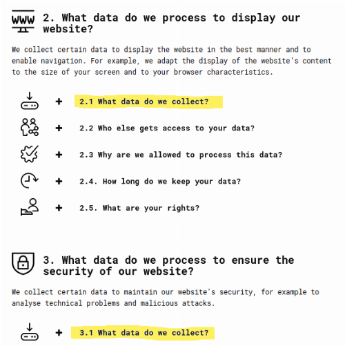
As this final seminar's presentation ended with another demo of the Privacy Icons Forum website's privacy policy page (nicely coming full-circle to the first session where Arianna Rossi already introduced the project), I yet again noticed how that document features two sections dealing with the data collected as I visit their website ("2. What data do we process to display our website" and "3. What data do we process to ensure the security of our website") instead of featuring one prominent headline combining the identically named "What data do we collect" subsections 2.1 and 3.1 into one canonical "What data do we collect when you visit our website" chapter?
I attempt to provide such a "layman-friendly" privacy policy, primarily designed around usage situations, on this website; a task admittedly eased by this website's extreme data minimalism."Privacy promise"
Icons or not: the cognitive load for the layperson is increased by the document's structure still following a "lawyer's mindset" (listing data collection separated by purpose), not that of the average user (simply "visiting the website") who wants to quickly assess what data is collected in the first place (and this again brings to mind many of the points from Helena Haapio's talk on designing efficient contracts in the seminar's third session, further highlighting how well the dots of this seminar series connect to provide food for thought).
But my thinking may well be too idealistic or naïve here -- as the presentations unanimously highlighted, the very nature of law will always require a higher level of detail and complexity than what design in other fields is used to. "Simplicity" in legal design for sure differs from "simplicity" in designing a tea kettle, but this also makes this field so fascinating. The need for legal compliance adds degrees of complexity to the already demanding task of user-centred design.
The challenge of overcoming traditional thinking
I am curious to observe how this young discipline of legal design is going to further narrow the huge "legal literacy" gap between law professionals and the average citizen. This seminar series has provided a wide range of perspectives (with example cases and literature references) to investigate further. Connecting the varied approaches and focus areas to cross-pollinate sounds exciting. And as the majority of actors in this field currently appear to be lawyers by training (which presumably comes with a certain way of seeing the world), cross-pollination could also be beneficial from design professionals who understand the essence legal thinking, but add perspectives from a different angle.
The biggest challenge of all, however, might be to popularize this thinking in century-old legal systems around the world where the visionary and enthusiastic group assembled in this seminar is possibly still a progressive minority critically eyed by the established mainstream? (I am thinking of the uphill battle of the web accessibility movement, where I experience this often frustrating struggle of "doing things right" first-hand.) Maybe one day every website will have a well-designed, comprehensive and icon-enhanced privacy policy that leaves no room for misinterpretation? Is that going to take an entire generation to change?
Thank you, Rossana Ducato and team, for your efforts in opening up this seminar series to external attendees, and to all the presenters for sharing their experience for inspiration!
Start over? This is the final article in a series of four posts, starting with Dr. Arianna Rossi's seminar session on legal design as a multi-faceted discipline. And my journal has more on #legaldesign as well.