Manuel Matuzović praised Josh Collinsworth's website, and I full-heartedly agree it's a very pleasant design.
Josh Collinsworth's website has a "Reduce motion" button right next to the "Dark mode" button.
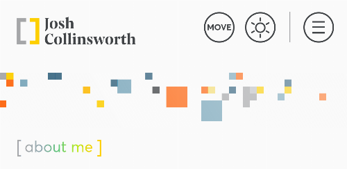
The thing that stood out the most (though merely a detail) is the "Move" button next to the "Dark mode" button in the header: since the design features some animations, users can disable these by simply clicking on that button.
This is inclusive design in action: while some users may have set a permanent preference to disable motion (and this is hopefully respected by website creators), enabling a simple switch for a motion-heavy website is a great feature.