I'm always happy to randomly stumble upon accessibility updates on websites -- today I noticed that caniuse.com (the most comprehensive resource for web developers to assess feature availability in different browsers) updated their colored tables with new cell backgrounds:
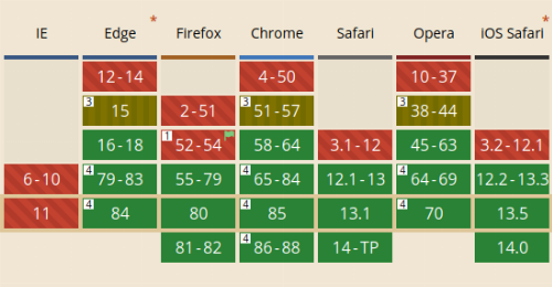
The differently coloured fields now feature a subtle background pattern for distinction -- an important step to comply with WCAG success criterion 1.4.1:
Color is not used as the only visual means of conveying information, indicating an action, prompting a response, or distinguishing a visual element"
Even the WSJ just wrote about this very a11y pattern a little while ago, mentioning Trello and others implementing it.
Caniuse.com has long had a "color blind mode" (activated from the site footer) where the original colors were replaced with ones more easily distinguishable, but this implementation is of course much more inclusive as it no longer requires a switch for those who need it and should not affect legibility for others.