Manuel Matuzović shares a thought-provoking experiment: the sample page accompanying his article "Accessible to some" has been optimized for screenreader software only, making it a hellish experience for users using the visual interface with a mouse.
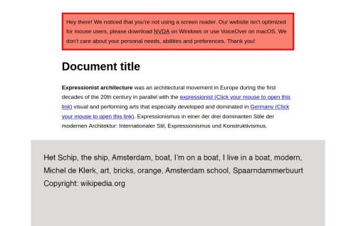
This is how the web looks for many people, just usually they are the ones this demo was optimized for: designers and developers still optimize for some hypothetical "average user" with a certain level of equipment, skills and abilities and -- sometimes apologetic, sometimes arrogant -- state that, despite their "best effort", other users are "unfortunately" unable to access them.
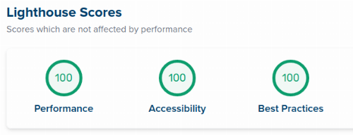
Manuel's thorough analysis of his artifact highlights how, despite creating an extremely inaccessible page, he managed to score 100% on the automated Lighthouse accessibility audit: just that some tool identifies a website to be accessible does not mean it is -- yet in this case for those "average" users.
Commonly it is the other way around; great to see this attitude flipped for educational purpose:
Your website, app, or new feature is only half as good if only some people can access it. [...] Before just you build and launch something, think about your users first and how your decisions might affect them.
Footnotes
- Is this, in an intentional way, Exclusive Design taken too far -- at the expense of the rest?↩
- This was also a topic at the a11y Berlin Meetup in March 2019, featuring an experiment in similar spirit: building the world's least-accessible website.↩