Co-learning at Accessibility Club #8 - some notes and thoughts

Accessibility Club is a meetup where professionals, enthusiasts and curious novices discuss how to create accessible digital technology. The 8th event of this series once again saw me inspired by what is essentially a random agenda with unpredictable topics - and outcomes!
The day started with two presentations. No invited speakers or keynotes, just two community members who had stepped up to prepare a talk. Given the varied background of the audience, this provided a good intro, giving everybody something common to talk about over lunch.
Manuel Matuzović presented a condensed version of a conference talk, "Eight tips for accessible React apps" - not something I work with, but he kept these eight points so general and comprehensible that I still feel I can use some of the methods in my own (vanilla JS) work.
Following him, Marc Haunschild presented his "Separation of concerns" - a workflow that keeps HTML markup and CSS styles entirely decoupled, much more so than with Bootstrap, BEM or other approaches. It was interesting to see this specific take on simplicity and its impact on both the project work and the outcome's accessibility.
Eleven sessions in three hours
Before embarking into an adventurous journey into event host Trivago's food court (not your usual office canteen), Joschi Kuphal and Tantek Çelik moderated the session planning. A very kind touch: anybody who had never been to a BarCamp-style event before was invited to come up first - this lowers the threshold for participation and potentially gives room for interesting niche topics. At the end of the exercise, we had a full session grid for the afternoon.
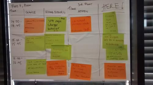
The following are my personal and subjective summaries of the three (out of eleven) sessions I got to attend:
Should a website offer to read out its content aloud?
This first session, "Web-based screen reader", condenses pretty much everything I enjoy about unconferences. We started out with a room of people stating not to have much experience but being here to learn, and for the first minute or so it may have seemed as if the facilitator would not get an answer to her question in this session: whether a client's request to add a "read out loud" button to a website is a good idea - and if not, how to convince the client of that without disenfranchising them from accessibility in general.
While the idea of such button could easily be dismissed with "people who need it have screen readers" (much as what has happened to "make font bigger" buttons), we instead started to collect reasons why it could be a good idea. The consensus was that sometimes small tools can be of great help for people otherwise easily overseen. One can think of a lot of people who could benefit from having a page read to them, who are neither in constant need of screenreader software nor might have the technical expertise to even adjust the most elementary accessibility settings of an OS.
Maybe even the "make text larger" buttons have a justification after all, when it comes to creating a universally accessible design? Can we really assume everybody has somebody to explain them how to resize a browser font? There must be a reason these still can be found, especially on public administration websites. Then again - why does it always go that way in the first place? Couldn't a website start out with big text to be inclusive and offer a "make the text smaller" button for those who prefer more text on the screen? I love that refreshing little idea nugget so much; it's essentially "user-controlled progressive enhancement"!
As we talked about mobile-first design, the idea was proposed to do "accessible-first design" instead. This sounds a lot like "universal design", but maybe giving it a more actionable name could help designers think inclusively? This is my second key takeaway from this session. Whereas "mobile-first" was essentially a move towards better accessibility (for users limited by their smaller devices) - it is today an established standard and maybe the same could happen to "a11y-first" if we push it enough?
Lastly, the answer we reached to the session facilitator's second question: just because one tool might not be ideal, this can still be presented in an encouraging way. Statistics and research may help in making a point, though especially with accessibility features we have to address the risk of bias - with those who need such features the most commonly being rather small groups, they are easiest to be ignored or forgotten in user research.
Ultimately, we came from the slightly confused "nobody in the room has the expertise" to a solid 45+ minutes of developing new perspectives and ideas. This is the magic of an unconference - everybody is the expert in the room and knowledge flows freely!
How to best collaborate on a11y between designers and developers
The idea of accessibility-first design popped up again right in the next session: we discussed a workflow where an organisation starts their development process with a bare-bone HTML structure and layout is added later ("take the CSS and drop it on the HTML"). This ensures maximum accessibility - as long as a process is in place that ensures it does not get lost in the process.
This session - a big group in the main room - discussed a wide range of perspectives, but (to me at least) ultimately boiled down to two key takeaways:
-
It is first and foremost about knowledge exchange ("education") and collaboration: accessibility is doable, even easy, and if done right doesn't interfere with product delivery. But it requires that both developers and designers communicate their knowledge and constraints to each other - maybe even in some form of pair programming, a very close iterative collaboration. Developing a shared language across the team - even a common nomenclature in files and code - helps to facilitate exchange.
-
Equally important, it is about process. Be it a "HTML first" workflow or other: if designers and developers are not on the same page from day one, it is hard to facilitate the required exchange. This also means there has to be an authoritative definition of what are the goals and workflows (one example problem from the discussion was a company where teams use different software tools to check colour contrast and, as their results may diverge, fight over what is "accessible").
Eventually framed like a "therapy session", the open discussion on "what do developers want from designers" had some gems in it - here are my four personal favourites:
-
Use native software elements rather than bespoke designs for default components (these almost always come with an a11y tradeoff, while the defaults were designed to be accessible) and challenge the initial assumption that was made for the most suitable UI component (see Alice Bartlett's talk "Dump your select tags"); HTML comes with a11y built in - "the question is: how do we not screw it up in the process?"
-
In an agile process, it can be good to start with an accessibility-first "MVP" version in the beginning, then add more challenging complexity in later iterations (this way the process becomes about pushing the boundaries while keeping the a11y level)
-
Acknowledge that design documents created for client sign-off are not necessarily useful for the work process - developers need a different level of documentation than business stakeholders (just as an example, the content hierarchy - e.g. the definition of headings H1, H2, etc. - is rarely communicated from design to development, and the latter have to rather come up with it themselves as they look at a design document)
-
Designers and developers should have an exchange over what elements of the design are crucial and which are not; this allows to focus on delivering on those parts that matter - if designs are treated as "this is how it has to be in all its details", we might be wasting effort on the wrong things
This was the biggest session I've ever attended at a BarCamp. The two facilitators (merging two session proposals into one, another thing you do on unconferences, which worked great for this one) did an admirable job in maintaining a focused discussion and providing everybody with a chance to contribute, despite the many people in the room.
A11y of data visualisations may always be a compromise
My last session was one I had proposed myself, as it relates to a topic that I've been thinking about ever since attending a highly inspirational Hacks/Hackers Berlin meetup a few months back: I realised that a lot of (interactive) data visualisations appear to be based on rather high assumptions regarding the audience's cognitive and physical abilities.
Following the discussions at that event and registering great awareness and interest in the topic within the community, I have since been working on preparing a Hacks/Hackers event to discuss these questions. So, I decided to put this headache of mine in front of a committee of ten for discussion.
At least three key challenges emerged from our discussion, which benefited greatly from our broad backgrounds, including two trained journalists:
-
The complexity of interactive visualisations stems from relying on the situational, and always subjective, interpretation by the user. Using the example of a tool to visualize the prevalence of street names on a map of Germany: it would simply be impossible to prepare a textual representation for any string a user may enter into the search field; the tool only works because viewers make sense of the results themselves.
-
An alternative representation of rich visualised information is not easy to design. While it is already hard to come up with good alt texts for simple static images, translating an interactive visualisation into text may appear close to impossible.
-
Data visualisations are never neutral (and data often is highly political). The choice of data, the presentation algorithm, the visual design, all convey inherent values. In the same way as the choice of colours may affect the viewer in their interpretation, the wording of an "alt text" does for the non-sighted user; creating an accessible representation is inevitably going to have the creators' values embedded.
From the discussion, I took away valuable impulses for further exploring possible design approaches (I'm deliberately avoiding the term "solutions" here):
-
One of the Inclusive Design Principles is to "offer choice". I quite liked the conclusion that users should always be offered (at least) two ways to experience any given data set; e.g. separate panels, one with a visual representation, the other with access to the data - or other options, depending on the data and purpose (just providing the raw data in a semantic format may not be enough: we discussed that for example giving access to an enormous data table, while offering choice, may not serve anybody). This can help to include people who may not be able to access one of the means provided.
-
For simple representations, using SVG, which by itself is semantic, can already make graphs more accessible; up to a certain degree, data can even be visualised purely based on semantic HTML and CSS (for example this responsive design of multiple parallel timelines, which even renders in a meaningful way on a 30-years-old NeXT browser).
-
Even when taking up a critical stance on AI (and its application for a11y purposes), assisting in the interpretation of an otherwise inaccessible data visualisation could be a relevant use case; for simpler representations, even a simple algorithm, turning the distribution of data points into text, would be entirely feasible (NB. the usual issues with bias and transparency apply to both complex and simple algorithms; this is always difficult territory). Sometimes, third party services, like reverse geocoding for a location data point, may help to translate data into human-comprehensible text.
Given that this session did not have the goal to find an answer, but to open up a discussion, I was not only impressed by the amount of perspectives we collected, but surprised to come out with an entire list of conceptual approaches to this issue for further exploration. It was a fruitful discussion on what we agreed to be a very important topic - not least because it is part of the professional ethics of journalists to create accessible content, while there is very little guidance on doing data journalism with a11y in mind. To be continued...
A room full of "non-experts" can make for a day of collaborative learning
Joschi and the Tollwerk crew, along with their generous sponsor Trivago, put up an inspiring event, with great vibes and a very friendly crowd. Unconferences are about people stepping up to share some insight or putting up a problem for discussion - and as this one, too, has proven: there is so much knowledge to be unveiled, if only you let it flow freely.
And to put the most important aspect last: I tremendously enjoy hanging out with compassionate folks who care about people and human values first. This is what makes the a11y community such a lovely place to be.
For future Accessibility Club events, check accessibility-club.org - or consider hosting your own!