User-centred transparency design for privacy - Part I: The layered approach

The EDPB's official "Guidelines on Transparency" under GDPR are a valuable, yet little-known, resource for designers. In this article, I examine the 40-pager for contributions on putting individuals in control of their personal data through user-centred design - beyond compliance, but by discussing ideas for truly privacy-centred user experience.
The goal of various guideline documents published by the former Article 29 Working Party (WP29) and its successor, the European Data Protection Board (EDPB), is to enable data controllers (e.g. website operators) to consistently apply GDPR requirements as they were intended. While not legally biding, these documents represent guidance from an independent EU authority coordinating and supplementing the work of national data protection agencies - a good source for laws' interpretation and, potentially, its enforcement.
EDPB guidelines translate the GDPR's regulations and intent into practice - in the case of the April 2018 "transparency" guidelines
[...] intended to enable controllers to understand, at a high level, WP29’s interpretation of what the transparency obligations entail in practice and to indicate the approach which WP29 considers controllers should take to being transparent while embedding fairness and accountability into their transparency measures.
It was with positive surprise that I found the "Guidelines on Transparency under Regulation 2016/679" to have almost schoolbook-like qualities in explaining how to transpose the often rather unspecific GDPR text into actionable design drivers - for compliance, but maybe more importantly for human-centred design.
Concerned with the agency for human beings in a technologised world, I am not primarily interested in compliance as such. Yet, the GDPR builds on the idea of putting people (back) in control over their personal data as a human right. So why not use GDPR guidelines to explore ways to design for a better privacy experience at large? The document itself calls for a "user-centric transparency experience" - could this be any more about design?
Along with many other rights, transparency is the most tangible right of a user under most privacy laws. Failure to provide full transparency may even invalidate all other GDPR efforts, as it is a key component of fair treatment of data subjects' rights:
Transparency is intrinsically linked to fairness and the new principle of accountability under the GDPR. It also follows from Article 5.2 that the controller must always be able to demonstrate that personal data are processed in a transparent manner in relation to the data subject.
To be informed about upcoming sequels, I suggest subscribing the RSS feed of this blog - also syndicated to my low-volume Twitter feed.This article series, starting with this post, consists of three parts in total:
-
A "layered approach" to transparency (this article)
-
Applying transparency design in practice (upcoming)
Complex information in small bites
The WP29 explicitly addresses an "inherent tension" between the GDPR's high requirements for comprehensive information on the one hand, and the demand for its concise presentation. In response, the guideline's most crucial contribution is a "layered" design approach to transparency - a key strategy when translating the complex legal requirements into human-first design. Dealing with the GDPR's transparency requirement, it appears, we are much deeper in design than legal territory; a true opportunity to empower individuals to take control over their data.
Notably, however, the authors also express that the suggested layering of information is just exemplary and could be adequately substituted with other innovative methods. So, while I start this series with discussing layered transparency, I ultimately hope that critical engagement with this approach at large can inspire new, even superior ideas and solutions within the design community.
Transparency in layers
What the EU's data protection body essentially suggests is to make privacy information more accessible by breaking it up into layers. Considering users' situational needs, the layered approach allows to avoid information overload by presenting essentials first and providing access to details second:
A central consideration of the principle of transparency outlined in these provisions is that the data subject should be able to determine in advance what the scope and consequences of the processing entails and that they should not be taken by surprise at a later point about the ways in which their personal data has been used.
The guideline text uses terms like "immediately apparent", "providing [information] directly to [data subjects]", "linking [data subjects] to [the information]" and "signposting [information]" - all by means that are appropriate under the specific circumstances. Hiding information deeper than two taps/clicks away, forcing the user to actively search for it, or obscuring it by reducing its visibility are explicitly deemed non-compliant: privacy-respecting, GDPR-compliant design puts visible effort in empowering the user to make informed decisions on their data.
What each layer should contain
The layered approach suggests to allow for simple presentation and easy navigation to the relevant slices of privacy information from every context where personal data is collected, while maintaining a comprehensive data processing statement at an easy-to-access location:
-
The first layer - a condensed version with a key outline - provides the user with the ability to immediately understand the consequences of their actions, along with their related rights and applicable information sources.
-
The second layer (which could well be "layered" again in itself to ease its use; the layering really is more of a design approach than a prescriptive rule) gives access to the complete information a data subject is entitled to or may desire, in a user-friendly manner. When linking into this second layer from elsewhere, the user should be taken directly to the section concerning the current use case - e.g. the link under a comment form should jump to the section on processing user comments in the privacy statement.
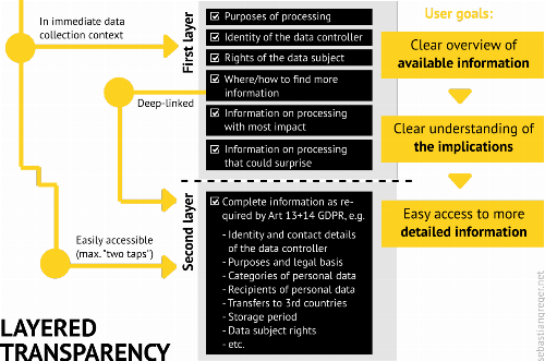
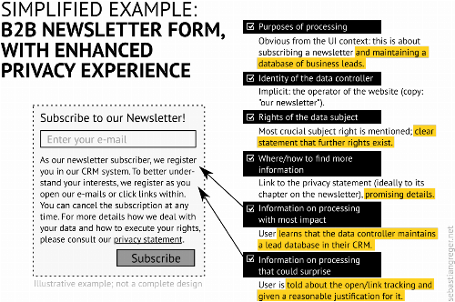
Following the WP29's guidelines, the following elements would be required on the first layer, ideally presented in the immediate data collection context (on the web, this could be a form, embedded third-party content, etc.):
-
Purposes of the processing: What is data being processed for?
-
Identity of the data controller: Who is processing the data?
-
Rights of the data subject: What are your rights as a user and how/where can you execute them?
-
Where/how to find more information: Links, e.g. to a complete privacy statement, ideally deep-linked to the applicable chapter.
-
Information on the processing with most impact: In the case of a contact form, this could for example be the fact that the user's data will be stored in a CRM system.
-
Information on processing that could surprise the data subject: This probably could, for example, include notifying a user at this point that signing up for a newsletter includes being tracked when opening e-mails or clicking links therein.
Looking at it from a user's perspective, this allows to get a baseline understanding of what data is being used for and by whom, as well as how to stay in control. The last two items, aspects I find commonly left out, are most crucial to ensure good user experience: telling the person how providing their data may impact them and disclosing any processing that may not be absolutely obvious to the individual affected.
Push vs. Pull - or: from ad-hoc notices to dashboards
Before looking at some concrete application examples, another modality discussed in the document is worth looking at:
-
"Push" notices, that provide ad-hoc, just-in-time information in the context of processing data
-
"Pull" UIs, such as "privacy dashboards", permission management tools or tutorials that allow easy access for users to all information and tools regarding their personal data
In my reading, the distinction in push and pull is not so much an alternative to the layered approach, but variants of designing them. The key difference is that "push" UIs do not require a user's active request for information, whereas "pull" UIs are more tailored towards serving users with a particular privacy concern.
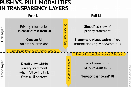
The push/pull modalities play a role in achieving maximum transparency as it comes to actively requested vs. displayed by default information, while the layer thinking helps to differentiate between the bare essentials vs. in-depth information.
Designing transparency layers
N.B. This text does in no way constitute legal advice. I am not a lawyer, and not qualified to provide legal advice. All content, provided solely for informational purposes, has been researched with greatest care, but to create legally compliant solutions, you should always consult a lawyer or solicitor.The design criteria I developed above, derived from the EU guidelines, are a powerful framework when trying to reduce privacy information to a user-centred minimum, while ensuring that the individual experiences to be in control of their own data.
Example 1: A B2B newsletter form
For the purpose of a hypothetical example, let's assume one of the standard use cases on the web today: the newsletter sign-up on a B2B website. It is a common pattern to keep the "legal" text to a minimum, often simply linking to a privacy statement page.
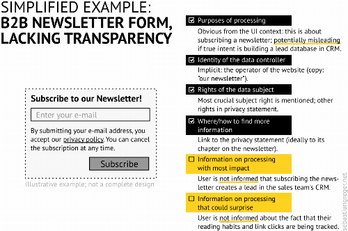
Now, if the "privacy policy" link leads directly to a dedicated page on the data processing regarding the newsletter (or at least to the specific chapter in a complete, well-designed privacy statement), this may still pass as minimal GDPR compliance (or not; this is for others, potentially courts, to decide). But from a user experience point of view, this design leaves too many questions and forces the burden on the user - conflicting with how the guideline authors interpret the transparency requirement.
In comparison, the transparency design criteria could be used to simply rewrite the information text, in order to cross off all six checkboxes for a well-designed "layer one":
NB. This is a simplified example for illustration; depending on the legal basis of processing and other specific factors, this design may not suffice all GDPR requirements.This text is slightly longer, but at the same time saves the user significant mental effort. The purpose of the newsletter is not hidden in long prose inside a chapter of the privacy statement, but instead presented up front. Using newsletter subscriptions for lead generation is common practice in B2B, so the website provider does not give anything away but assures the user of being a trustworthy business partner. The user is informed about the open/link tracking, along with a good explanation for the reasons and in reproducible unison with the stated purpose of maintaining the newsletter.
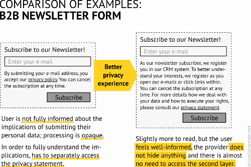
If evaluating UX from a limited UI point of view, the increased amount of text may well rise concerns about reduced usability (side note: others have suggested even much more complex UIs for minimum compliance than what my example proposes). However, if taking into account the otherwise necessary visit to the privacy statement page, and the positive CX (customer experience) from dealing with a business that is transparent about their data use policy, there is a strong argument for the revised form to be the better design. Apart from that, this is of course just a very barebone example - both UI and copy text of the latter example could likely be iterated for further improvement.
Example 2: Embedding third-party content
Embedding third-party content inevitably allows others to track a website's visitor. For example an embedded YouTube video may allow Google to register what website a logged-in GMail user is viewing.
It is therefore good practice (and becoming more common) to only activate third-party content after users agree. Here, again, the layered approach to transparency can help reduce mental load. In order to make an instant decision, more than a button has to be provided: a user instantly needs at least the minimal information required to evaluate whether they want to take that step.
A solution can be to provide a short one-liner mentioning the third party and consequences, and linking directly to a more thorough explanation. This allows users to make an informed decision, instantly or in-depth. I recently demoed this approach in my post on self-hosted OSM maps:

Similar implementations can be seen on many major media sites today (medium.com, tagesschau.de, ...). For the purpose of evaluating the transparency experience of the user, it is crucial that the initial screen provides enough information to make an informed decision and access more details if desired.
Example 3: A layered privacy statement
As mentioned earlier, also the privacy statement page itself can use a layered approach. While keeping an eye on the legal requirements, user intent is key for designing a privacy statement that complies with the design requirements indicated by the WP29 guideline document.
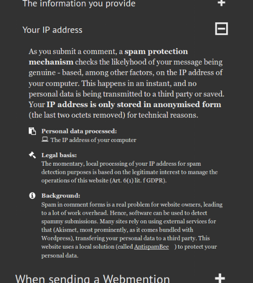
A constant work-in-progress, my own privacy notice on this site (open in new tab) could serve as an exemplary attempt for such design. The information has not been arranged from a site owner's perspective, as is often the case, but aims to directly answer situational privacy concerns a user may have; after all, users do not come to the privacy statement page for a half-hour read of a legal document, but to find answers to specific questions:
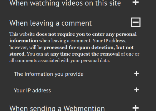
In my opinion, there is far too little debate on the UX of privacy statements. Any constructive commentary or links to solutions that may serve as benchmarks are most welcome in the comments section below!Again, there is likely room for improvement. My design has, among others, been criticised for requiring too many clicks. Other shortcomings may be the rather long form of the document once all the sections have been expanded. Finding the right balance between rich information and concise presentation is hard; the key point of this demo is to showcase how the layered approach to transparency design can deliver a more user-centred experience of privacy information.
Summary
As the WP29 guidelines emphasise: finding means to fulfil the GDPR's extensive transparency requirements without overloading - in contrary: empowering - the user is a great challenge. The authors propose a solution based on layering the information, from concise essentials, presented just-in-time and without much interaction in the use context, to more detailed information in well-designed privacy statements.
In my evaluation, I distilled six criteria that the first, ad-hoc layer should fulfil and demonstrated some ideas how to turn these into user interfaces. Providing more information for the sake of better transparency inevitably comes with a loss of simplicity that is often seen as a lead motif in developing usable user interfaces. However, when extending UX thinking into what the guidelines call a “user-centric transparency experience”, the additional information may well turn into improved usability.
In the second part of this article, I distill further design impulses from the "Guidelines on Transparency under GDPR" - with a focus on how to present the often abstract information about data-related processes.
Footnotes
- The official document is written with no specific medium in mind, applying to websites just as much as to telephone calls or other contexts where personal data may be dealt with; paragraphs 35-37, nonetheless, outline a rather specific approach for digital environments.↩
- At the end of the guideline document, the WP29 provides a comprehensive table of all the information to be provided under Art. 13+14 GDPR.↩
- This, keeping individuals in control over their personal data, is the core concern of privacy legislation around the globe; including, but not limited to, the GDPR.↩
- Using the information for other sales purposes might - at least when processing is based on consent - not be GDPR-compliant anyway, if the officially stated purpose of processing does not include the CRM but is limited to the newsletter; ref. 'purpose limitation', Art. 5(1b) GDPR.↩
- I personally believe that a sequence of conscious interactions expressing intent carry often less mental load than having to scroll through long pages; here obviously UI dogmas compete, plus personal taste plays a role.↩