Using the "Cognitive bias codex" for design concept evaluation

Cognitive bias - the tendency of the human brain to interpret information based on unrecognised irrational factors - is a phenomenon that has been fascinating me for well over a decade. There is no more efficient way to improve the quality of a design concept than by doing a heuristic evaluation on potential cognitive biases that skew the perception we have of reality.
And believe me: it works - no matter how much I may believe in the fond grounding of my perception in "real-world data", I come away surprised about my own brain being misled in one way or the other. Every. Single. Time. (It's just how brains work!)
The "Cognitive bias codex" by Benson/Manoogian
In an impressive data analysis exercise (definitely an interesting method to use a crowdsourced Wikipedia list as data), Buster Benson did an exhaustive review of all the cognitive biases listed on Wikipedia back in September 2016. His work just became even more easily accessible as, together with John Manoogian III, he turned it into a comprehensive infographic:
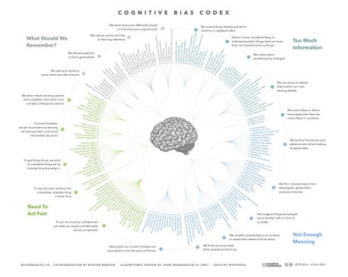
The accompanying article highlights Benson's four core conundrums of cognitive bias (too much information, not enough meaning, not enough time & resources, not enough memory) and even provides a cheat sheet with suggestions to overcome these.
A useful tool for the designer
The Huffington Post quotes Manoogian, explaining how this visualization can help its reader:
You realize that your brain is adapted to solve all these basic level survival problems and now that we are trying to do higher order things, the brain has its own ideas.
This is why I believe that Benson and Manoogian have just done any designer a huge favour: when teaching about usability, I commonly start with an excursion into fundamentals of the psychology of perception - understanding why the human brain processes information the way it does. (recommended reading: Colin Ware's Information visualization: Perception for design.)
Just as Nielsen's classic ten usability heuristics help reviewing an artefact under consideration of the various aspects that help users' brains to process what is going on in a user interface, using the Cognitive bias cheat sheet as a list of heuristics to reflect on one's own design work is a simple, yet powerful tool to reduce the mistakes we make as our perception is often blinded in regard to our own shortcomings in objectivity/rationality.
This is definitely a good one to hang up somewhere in the office, either on the cubicle wall or maybe a meeting room? ...and Benson even mentions to be working on a book version!